Have Your Say in the Kiosk Design
Three finalists; one design. Acton decides
Which of these designs would you like to see on the Acton Market Kiosk?
This is your chance to have your say.
Action Acton is inviting the local community in Acton to vote for one of three finalists in the Kiosk Design Competition, a competition to design the artwork for the Acton Market kiosk.
The three finalists, all from the local area, have showed that Acton and Ealing are not lacking in graphic design talents.
The brief was to design the artwork for the outside of the kiosk to include a map of the area and an information board. Entries are required to live, work or go to school in Ealing or Acton.
The winner, chosen by public vote, will receive £500 and the winning design will cover the kiosk.
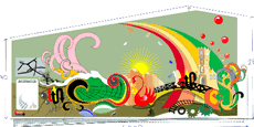
Entry 1
Artist’s Statement Entry 1:
“I believe I should win this competition because, after living in the area, the history of this great borough interests me and is part of British history. This is reflected in my design. Acton, which means “Oak Farm” as the oak trees suggest is part of my design as well as the St. Mary Church, which is dated back to the 13 century.
"Acton was considered as the stopping point for travellers who are passing by, to get to Oxford and other parts of England. I’ve incorporated this into the design as the arrows are symbols for housing and inns and the bridge suggests Oxbridge leading outwards of the area.
"The railway tracks suggest Acton tram and railway. My design will not only have an information board and a map of the area, it also has Acton’s history in a composition to tell the story of what a great borough we live in. I love to design and I enjoy this design because it has a meaning to the area we live in.”
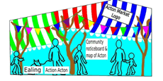
Entry 2
Artist’s Statement Entry 2:
“I have lived in the Ealing/Acton area for 10 years and have recently moved to a flat on Churchfield Road. I love the Acton Market and agree that the nasty green kiosk should reflect the vibrancy of the Market.
"This is why I have used the striped canopies of the market stalls as my inspiration. I chose to use outlines of people to show the multicultural aspect of the town rather than use different skin tones. I wanted to include the trees, which are in the market place area but decided to leave them bare instead of covering them with leaves.
This was partly because of their current winter appearance and partly because I wanted the colours of the striped canopies to stand out. There is no way of camouflaging the kiosk so rather than trying (and failing) to make it blend in, I think it should stand out in a bright and joyous way!”
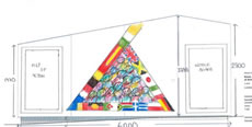
Entry 3
Artist’s Statement Entry 3:
“After living in Acton from birth, I thought it would be important to give something to the community. As a resident I am interested in the community of Acton. It would also be a great sense of achievement to see my design, if used, in Acton. My design demonstrates us (being all cultures) united as one in the community of Acton.”
February 7, 2008
Related links
|


